Sugar on Top · Kit 1
Velvet Noir
Velvet Noir. Indulgent.
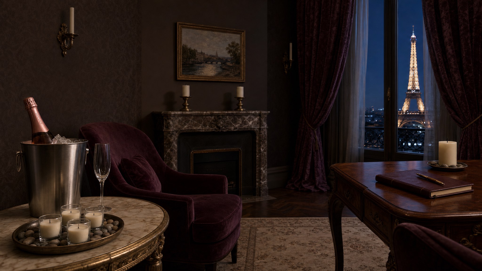
A hotel room in Paris. Late evening. Pink champagne, candlelight, and the city out the window.
See the paletteThe palette
Eight colors. Eight jobs.
Dark depth lifted by champagne pink. This is Velvet Noir.
Two darks, one bridge, one plum, one pink, one gold, and two neutrals at opposite temperatures: warm linen inside, cool pearl at the window. No two colors do the same job.
-
1 · Value extreme
Velvet Drape
#0F0B12
The deepest dark. The cool shadow of the city at midnight, past the curtain.
Pearl Light text on Velvet Drape · 16.70:1 AAA
-
2 · Anchor
Dark Ganache
#2C1810
Real dark chocolate, not black, not corporate. The outside of the truffle box.
Cocoa Cream text on Dark Ganache · 13.73:1 AAA
-
3 · Mid-warm bridge
Truffle Interior
#6B3A2A
That moment you bite in. The rich brown between dark and milk.
Pearl Light text on Truffle Interior · 7.95:1 AAA
-
4 · Flex hue
Smoky Plum
#6B3052
Bruised evening. The wine in the glass on the desk where she’s writing.
Smoky Plum text on Pearl Light · 8.29:1 AAA
-
5 · Counterweight
Rosé Fizz
#D4A0A0
Pink champagne in crystal. The pink of bubbles catching candlelight.
Velvet Drape text on Rosé Fizz · 8.67:1 AAA
-
6 · Metallic
Champagne Foil
#C9A96E
The actual gold. Foil at the edge of the wrapper. The candlelight made literal.
Velvet Drape text on Champagne Foil · 8.71:1 AAA
-
7 · Warm neutral
Cocoa Cream
#F2E6D9
The tissue paper inside a luxury gift box. Warm, soft, never stark white.
Dark Ganache text on Cocoa Cream · 13.73:1 AAA
-
8 · Cool neutral
Pearl Light
#EAEEF0
The pearl on the nightstand. The cool gleam off the marble writing desk.
Dark Ganache text on Pearl Light · 14.44:1 AAA
What’s inside
These aren’t hex codes on a white page.
They’re a world.
-
Color Palette
Eight colors, named and storied, each with its material, its pairings and its contrast numbers.
-
The Champagne Suite
Playfair Display, Cormorant Garamond and Inter. Three free Google Fonts, three volumes of voice.
-
Brand Board
Your visual identity on one page. Pin it above the desk.
-
Social Headers
Headers sized for each platform, in the same order of voice: gold eyebrow, Playfair name, pink line.
-
Link-in-Bio Page
One link, the whole suite, in mobile format.
-
Color Combinations Cheat Sheet
The signature pairings, the contrast stack, and which pairs stay headline-only.
The materials
Nothing is flat. Everything is material.
Every swatch should make you want to touch it.
-
Crushed velvet
Deep saturation with a subtle directional pile. Smoky Plum.
-
Dark chocolate
Matte, with grain. The outside of the truffle box. Dark Ganache.
-
Champagne foil
Metallic and reflective. The ribbon catching candlelight. Champagne Foil.
-
Pearl and marble
Cool gleam, subtle, never flat. The marble writing desk. Pearl Light.
-
Linen paper
The tissue in the gift box, cream cardstock, the cookbook page. Cocoa Cream.
-
Midnight glass
The night sky on the window, the faintest blue-violet. Velvet Drape.
“I see you, world, but I am up here drinking champagne and writing my masterpiece.”